先日制作した案件で、タイムライン(過去→未来)があったんですね。
こういうのです。
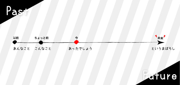
デザインがイラレで来ていて、さてどうしましょうか、と。
もちろん画像でもOKなんですが、横長をタイムラインをスマホで見たら小さくて見えない。
かといって縦長の画像は作りたくない。※それなりに数があったので。
それじゃCSSだけで実装しましょ、とういうことになりました。
【DEMO】
やってみよう
条件
- 広い画面では横型、狭くなったら縦型にする
- 項目数は変動する
- ポイントごとに目印をつける
もちろん、まず一直線を引いて、その上に絶対配置でポイントを打つのもアリだと思います。
今回は基本形を元にちょっといろいろしてみました。
けどあんまりうまくいかなかった。。。
ついでにCSSがいろいろ汚染しまくって悪い見本みたいになってます。
お目汚しですが、よかったらどうぞ。。。
基本形
HTML
<div class="timeline">
    <div class="timeline-item">
        <p class="timeline-label">10年前</p>
        <p class="timeline-content">じつはまだ学生でした。</p>
    </div>
    <div class="timeline-item now">
        <p class="timeline-label">現在</p>
        <p class="timeline-content">結構いい年です。</p>
    </div>
    <div class="timeline-item">
        <p class="timeline-label">10年後</p>
        <p class="timeline-content">Webはまだ大丈夫。</p>
    </div>
    <div class="timeline-item">
        <p class="timeline-label">20年後</p>
        <p class="timeline-content">スナフキンになりたい。</p>
    </div>
    <div class="timeline-item">
        <p class="timeline-label">その後</p>
        <p class="timeline-content">仙人。</p>
    </div>
</div>
SASS
.timeline{
    padding: 3rem 5rem;
    background-color: #f0f0f0;
    &-item{
        position: relative;
        border-left: 1px solid #000;
        padding: 0 0 30px 30px;
        &:before{
            content: '';
            display: block;
            width: 10px;
            height: 10px;
            position: absolute;
            left: 0;
            top: 0;
            border-radius: 100%;
            background-color: #000;
            transform: translateX(-50%) translateY(-50%);
        }
        &:last-of-type{
            padding-bottom: 0;
            &:before{
                width: 0;
                height: 0;
                border-style: solid;
                border-width: 10px 5px 0 5px;
                border-color: #000000 transparent transparent transparent;
                border-radius: 0;
                background-color: transparent;
                top: auto;
                bottom: 0;
                transform: translateX(-50%) translateY(0);
            }
        }
    }
    @media(min-width : 768px){
        display: table;
        table-layout: fixed;
        width: 100%;
        &-item{
            display: table-cell;
            vertical-align: top;
            padding: 0;
            border:{
                top: 1px solid #000;
                bottom: 0;
                left: 0;
            }
            &:last-of-type{
                padding-bottom: 0;
                text-align: right;
                &:before{
                    border-width: 5px 0 5px 10px;
                    border-color: transparent transparent transparent #000000;
                    top: 0;
                    right: 0;
                    bottom: auto;
                    left: auto;
                    transform: translateX(0) translateY(-50%);
                }

                p{
                    text-align: left;
                }
            }
        }
        &-label,
        &-content{
            transform: translateX(-50%);
            text-align: left;
            display: block;
            max-width: 70%;
        }
        &-label{
            text-align: center;
            position: absolute;
            top: 0;
            left: 0;
            transform: translateX(-50%) translateY(-120%);
        }
        &-content{
            margin-top: 10px;
        }
        &-item:last-of-type &-label,
        &-item:last-of-type &-content{
            transform: translateX(50%);
            text-align: left;
            display: inline-block;
            max-width: 70%;
        }
        &-item:last-of-type &-label{
            left: auto;
            right: 0;
            transform: translateX(50%) translateY(-120%);
        }
    }
}
/* 現在地 */
.timeline-item.now:before{
    background-color: #f00;
}
やってること
そんなに難しいことはしてません。
displayを切り替えて、ボーダー引く場所を変えているだけです。
狭い画面では縦型なのでdisplay: block;でいいですね。ボーダーは左に引きました。
横型の場合は、親要素をtableに、子要素をtable-cellにしてみました。(※flexでもうまくいくかもしれません。)
それから親要素にtablelayout: fixed;を指定して均等に割ります。
文字や時間の長さに長短がある場合は子要素のwidthをパーセントで指定してあげればOKです。
目印は子要素の擬似要素で。
基本的には左上に絶対配置して、自分の大きさ分だけ移動(transform: translateX(-50%) translateY(-50%);)します。
最後の子要素だけは矢印っぽくしたいので、三角にしました。これは縦横で向きを変えてあげてくださいね。
現在地は専用のクラスを振って文字色を変えました。
【DEMO】にのっけた他のやつのコードも一応載せときますね。
本当は背景を矢印っぽくするところまで行きたかったんですけど、パッと思いつかなかったので、とりあえず今回はここまで。
年末進行でお忙しいと思いますが、みなさんお体に気をつけて頑張っていきましょう!
HTML
<h2>基本形</h2>
<div class="timeline">
    <div class="timeline-item">
        <p class="timeline-label">10年前</p>
        <p class="timeline-content">じつはまだ学生でした。</p>
    </div>
    <div class="timeline-item now">
        <p class="timeline-label">現在</p>
        <p class="timeline-content">結構いい年です。</p>
    </div>
    <div class="timeline-item">
        <p class="timeline-label">10年後</p>
        <p class="timeline-content">Webはまだ大丈夫。</p>
    </div>
    <div class="timeline-item">
        <p class="timeline-label">20年後</p>
        <p class="timeline-content">スナフキンになりたい。</p>
    </div>
    <div class="timeline-item">
        <p class="timeline-label">その後</p>
        <p class="timeline-content">仙人。</p>
    </div>
</div>

<h2>数が減っても大丈夫</h2>
<div class="timeline">
    <div class="timeline-item">
        <p class="timeline-label">10年前</p>
        <p class="timeline-content">じつはまだ学生でした。</p>
    </div>
    <div class="timeline-item now">
        <p class="timeline-label">現在</p>
        <p class="timeline-content">結構いい年です。</p>
    </div>
    <div class="timeline-item">
        <p class="timeline-label">30年後</p>
        <p class="timeline-content">煙になりたい。</p>
    </div>
    <div class="timeline-item">
        <p class="timeline-label">その後</p>
        <p class="timeline-content">仙人。</p>
    </div>
</div>

<h2>数が増えても大丈夫</h2>
<div class="timeline">
    <div class="timeline-item">
        <p class="timeline-label">10年前</p>
        <p class="timeline-content">じつはまだ学生でした。</p>
    </div>
    <div class="timeline-item now">
        <p class="timeline-label">現在</p>
        <p class="timeline-content">結構いい年です。</p>
    </div>
    <div class="timeline-item">
        <p class="timeline-label">10年後</p>
        <p class="timeline-content">Webはまだ大丈夫。</p>
    </div>
    <div class="timeline-item">
        <p class="timeline-label">20年後</p>
        <p class="timeline-content">スナフキンになりたい。</p>
    </div>
    <div class="timeline-item">
        <p class="timeline-label">30年後</p>
        <p class="timeline-content">煙になりたい。</p>
    </div>
    <div class="timeline-item">
        <p class="timeline-label">その後</p>
        <p class="timeline-content">仙人。</p>
    </div>
</div>


<h2>ボーダー有り</h2>
<div class="timeline border-dashed">
    <div class="timeline-item">
        <p class="timeline-label">10年前</p>
        <p class="timeline-content">じつはまだ学生でした。</p>
    </div>
    <div class="timeline-item now">
        <p class="timeline-label">現在</p>
        <p class="timeline-content">結構いい年です。</p>
    </div>
    <div class="timeline-item">
        <p class="timeline-label">10年後</p>
        <p class="timeline-content">Webはまだ大丈夫。</p>
    </div>
    <div class="timeline-item">
        <p class="timeline-label">20年後</p>
        <p class="timeline-content">スナフキンになりたい。</p>
    </div>
    <div class="timeline-item">
        <p class="timeline-label">その後</p>
        <p class="timeline-content">仙人。</p>
    </div>
</div>


<h2>ストライプ背景</h2>
<div class="timeline bg-stripe">
    <div class="timeline-item">
        <p class="timeline-label">10年前</p>
        <p class="timeline-content">じつはまだ学生でした。</p>
    </div>
    <div class="timeline-item now">
        <p class="timeline-label">現在</p>
        <p class="timeline-content">結構いい年です。</p>
    </div>
    <div class="timeline-item">
        <p class="timeline-label">10年後</p>
        <p class="timeline-content">Webはまだ大丈夫。</p>
    </div>
    <div class="timeline-item">
        <p class="timeline-label">20年後</p>
        <p class="timeline-content">スナフキンになりたい。</p>
    </div>
    <div class="timeline-item">
        <p class="timeline-label">その後</p>
        <p class="timeline-content">仙人。</p>
    </div>
</div>


<h2>ストライプ背景</h2>
<div class="timeline-wrapper">
    <div class="timeline bg-arrow">
        <div class="timeline-item">
            <p class="timeline-label">10年前</p>
            <p class="timeline-content">じつはまだ学生でした。</p>
        </div>
        <div class="timeline-item now">
            <p class="timeline-label">現在</p>
            <p class="timeline-content">結構いい年です。</p>
        </div>
        <div class="timeline-item">
            <p class="timeline-label">10年後</p>
            <p class="timeline-content">Webはまだ大丈夫。</p>
        </div>
        <div class="timeline-item">
            <p class="timeline-label">20年後</p>
            <p class="timeline-content">スナフキンになりたい。</p>
        </div>
        <div class="timeline-item">
            <p class="timeline-label">その後</p>
            <p class="timeline-content">仙人。</p>
        </div>
    </div>
</div>
SASS
.timeline{
    padding: 3rem 5rem;
    background-color: #f0f0f0;
    &-item{
        position: relative;
        border-left: 1px solid #000;
        padding: 0 0 30px 30px;
        &:before{
            content: '';
            display: block;
            width: 10px;
            height: 10px;
            position: absolute;
            left: 0;
            top: 0;
            border-radius: 100%;
            background-color: #000;
            transform: translateX(-50%) translateY(-50%);
        }
        &:last-of-type{
            padding-bottom: 0;
            &:before{
                width: 0;
                height: 0;
                border-style: solid;
                border-width: 10px 5px 0 5px;
                border-color: #000000 transparent transparent transparent;
                border-radius: 0;
                background-color: transparent;
                top: auto;
                bottom: 0;
                transform: translateX(-50%) translateY(0);
            }
        }
    }
    @media(min-width : 768px){
        display: table;
        table-layout: fixed;
        width: 100%;
        &-item{
            display: table-cell;
            vertical-align: top;
            padding: 0;
            border:{
                top: 1px solid #000;
                bottom: 0;
                left: 0;
            }
            &:last-of-type{
                padding-bottom: 0;
                text-align: right;
                &:before{
                    border-width: 5px 0 5px 10px;
                    border-color: transparent transparent transparent #000000;
                    top: 0;
                    right: 0;
                    bottom: auto;
                    left: auto;
                    transform: translateX(0) translateY(-50%);
                }

                p{
                    text-align: left;
                }
            }
        }
        &-label,
        &-content{
            transform: translateX(-50%);
            text-align: left;
            display: block;
            max-width: 70%;
        }
        &-label{
            text-align: center;
            position: absolute;
            top: 0;
            left: 0;
            transform: translateX(-50%) translateY(-120%);
        }
        &-content{
            margin-top: 10px;
        }
        &-item:last-of-type &-label,
        &-item:last-of-type &-content{
            transform: translateX(50%);
            text-align: left;
            display: inline-block;
            max-width: 70%;
        }
        &-item:last-of-type &-label{
            left: auto;
            right: 0;
            transform: translateX(50%) translateY(-120%);
        }
    }


    /* ボーダー有り */
    &.border-dashed &-item{
        border-top: 1px dashed #ccc;
        padding: 10px;
        &:last-of-type{
            border: {
                top: none;
                bottom: 1px dashed #ccc;
            }
        }


        @media(min-width : 768px){
            padding: 0;
            border:{
                top: 1px solid #000;
                left: 1px dashed #ccc;
            }
            &:last-of-type{
                border: {
                    top: 1px solid #000;
                    right: 1px dashed #ccc;
                    bottom: 0;
                }
            }
        }
    }

    /* ストライプ背景 */
    &.bg-stripe &-item{
        &:nth-of-type(odd){
            background-color: #e8e8e8;
        }
        &:nth-of-type(even){
            background-color: #fff;
        }
    }
    @media(min-width : 768px){
        &.bg-stripe &-label,
        &.bg-stripe &-content{
            transform: translateX(0);
            text-align: left;
            display: block;
            max-width: 70%;
        }
        &.bg-stripe &-label{
            transform: translateX(0) translateY(-120%);
        }
        &.bg-stripe &-content{
            display: inline-block;
        }
    }

    /* PCの時は矢印っぽく */
    &-wrapper{
        padding: 3rem 5rem;
        background-color: #f0f0f0;
    }
    &.bg-arrow{
        padding: 0;
    }
    &.bg-arrow &-item{
        position: relative;
        border: {
            top: none;
        }


    }
    @media(min-width : 768px){
        &.bg-arrow{
            padding: 20px 0 0;
            overflow: hidden;
        }
        &.bg-arrow &-item{
            &:before{
                height: 100%;
                width: 100%;
                top: 0;
                left: 0;
                right: 0;
                bottom: 0;
                border:{
                    color: transparent;
                    radius: 0;
                }
                box-shadow: 1px -1px 2px rgba(125, 125, 125, 0.8);
                transform: skew(-45deg);
                transform-origin:0 0;
                background: -moz-linear-gradient(45deg,  rgba(0,0,0,0) 0%, rgba(0,0,0,0.3) 100%); /* FF3.6-15 */
                background: -webkit-linear-gradient(45deg,  rgba(0,0,0,0) 0%,rgba(0,0,0,0.3) 100%); /* Chrome10-25,Safari5.1-6 */
                background: linear-gradient(45deg,  rgba(0,0,0,0) 0%,rgba(0,0,0,0.3) 100%); /* W3C, IE10+, FF16+, Chrome26+, Opera12+, Safari7+ */
            }
        }

        &.bg-arrow &-label,
        &.bg-arrow &-content{
            transform: translateX(0);
            text-align: left;
            display: block;
            max-width: 70%;
        }
        &.bg-arrow &-label{
            transform: translateX(0) translateY(-120%);
        }
        &.bg-arrow &-content{
            display: inline-block;
        }
        &.bg-arrow &-item:last-of-type{
            padding-bottom: 0;
            text-align: right;
            &:before{
                border: none;
                top: 0;
                left: 0;
                right: 0;
                bottom: 0;
                transform: translateX(0) translateY(0) skew(-45deg);
            }
            p{
                text-align: left;
                display: block;
            }
        }
    }
}

/* 現在地 */
.timeline-item.now:before{
    background-color: #f00;
}
